Rommel Review, PART II
by Rick Brownlee
 Hopefully, most of you were able to read
part I of the Tamiya figure, Rommel
Review. In it, I talked of the early stages of construction and painting of the
figure, plus some text about the thinking that went into the base, platform,
section of the damaged building, etc.
Hopefully, most of you were able to read
part I of the Tamiya figure, Rommel
Review. In it, I talked of the early stages of construction and painting of the
figure, plus some text about the thinking that went into the base, platform,
section of the damaged building, etc.
Picture #1: This picture shows the
finished project. However, before gluing down the platform and wooden boxes, I
added very fine sand mixed with water and white glue to the ground layer and on
the piles of rocks under the platform and around the back and side masonry
walls. Then I used white bond paper painted a dull greenish color (the
undersides of the plant life were painted a duller and darker greenish color)
with tube acrylics. Paper is easy to glue in and easy to bend. The boxes were
made of bass wood strips and given two coats of flat varnish to seal the wood.
Then I used tube oil paints to paint the boxes to show a weathered looking
surface area. The rolled up map in Rommel's right hand was made from white bond
paper, also. I painted it with tube acrylics and put in topographical elevation
lines with very sharply pointed Prismacolor pencils. Prismacolor pencils are
expensive. But for me, they last a very long time and are the best made. I have
some of them, rather short little guys now, that are over 35 years old.
The lens areas of the binoculars were
drilled out, the holes were painted black and later filled with five minute
epoxy glue. When dry the epoxy glue looks like a shiny glass lens. I tried it
once to make a watering hole in a scene. It was great as to being clear and
looking like a pond. Several months later it showed a yellow tint to it. So use
liquid resin for that. We learn by doing. Right?
I then sprayed the lower part of the
scene with a light dusting of Model Master light gray. I did the same for the
lower part of the masonry walls. I'll discuss the Pour Le Merite, the
Union Jack and the brushes I use after explaining how I painted the figure.
I use a flat white enamel in
a spray can to cover the figure before I start painting with either tube
acrylics or tube oil paints. I'm not sure this is necessary. But the white
surface helps me to mix the colors more correctly as to shade and tone I want. I
use a rectangle piece of auto safety glass for a palette. I tape a piece of
 white paper to the back
of it. I squeeze amounts of the colors I will need on to the palette and mix the
colors with a palette knife artists use or sometimes I mix colors with the brush
itself. Then I apply the paint to the figure making all the strokes go in the
same direction. This laying in the base coat with tube acrylic doesn't have to
be perfect in what shade or color you apply. Because you're going to paint over
the acrylics with the tube oil paints later. I just put in the colors with no
regard to shadows or highlight area. I'll do that with the oils.
white paper to the back
of it. I squeeze amounts of the colors I will need on to the palette and mix the
colors with a palette knife artists use or sometimes I mix colors with the brush
itself. Then I apply the paint to the figure making all the strokes go in the
same direction. This laying in the base coat with tube acrylic doesn't have to
be perfect in what shade or color you apply. Because you're going to paint over
the acrylics with the tube oil paints later. I just put in the colors with no
regard to shadows or highlight area. I'll do that with the oils.
A word here about flesh tones. Tricky
subject. Modelers all have their own ideas about what flesh should look like.
We'll leave a 5 day growth of whiskers or the effects of sun on the face out of
the equation in this review. I make flesh tone with a dab of red, a dab of
yellow, a dab of burnt sienna and a lot of white. I usually paint the face
first. When I get that right, everything else seems to go better. A word about
eyeballs. In the larger 120mm busts for example, the eyes are bigger than just a
dot, of course. So the figure painter has to draw in the eyeball in a circular
shape. Go look in a mirror at your eyes. Do you notice that only the lower half
of the iris sticks out below the eyelid? So if we think of the iris as a circle
we're only painting a little more that half of a circle on to the eyeball.
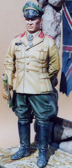
Picture #2: This shows the completed
figure after I've applied the tube acrylics and the tube oil paints. Until
about one and a half years ago I didn't use oils on top of the acrylics
although I know that Bill Horan, the famous figure painter does it that way.
Horan has wonderful books on painting and scratch-building figures. A real
master of painting and composition. How he sets up the elements in relation to
one another, is masterful.
Oil paints are expensive but you can
start with just five tubes; the primary colors, black and white. So with red,
blue and yellow (the primary colors) you can make every color you would want
using the principles of the color wheel; i.e. blue and yellow make green, red
and blue make violet, etc. I started with these five colors and added other
colors over a period of time so the initial cost wasn't so much.
Picture #3: shows a close up and you
can see the ripped and torn Union Jack hanging in the arch. My idea was to
indicate the area had been British held territory. Also, the red in the flag
compliments the red in Erwin's rank on his epaulettes and lapels, as I said in
Part I.
Some time back, when I used tube
acrylics only it was so much harder to blend colors such as from a darker green
in the shadow areas/folds of Rommel's pants to
 the lighter green areas at the
top of the fold next to the shadow areas. It was very hard to blend the two
tones, from the dark green to the light green. For one reason, the acrylics dry
very fast. That acrylics dry fast can be a good thing. But with blending, the
fast drying paint makes blending more difficult. Once I started painting over
the acrylic base coat with tube oil paints the blending part became so much
easier because the oil paints dry so much slower. On the figure the oil colors
mix together so much better. You'll notice that with oils, generally, the
darker the color the faster it dries, The lighter the color the slower it dries.
Light flesh tones can take several days to dry, for example. I should mention
here that I do not use turpenoid or turpentine as a thinner or as a clean up
agent with my oil paints. I use mineral spirits. In college we used turpentine
but now I know that mineral spirits works just as well and you don't have that
pungent odor associated with turpentine.
the lighter green areas at the
top of the fold next to the shadow areas. It was very hard to blend the two
tones, from the dark green to the light green. For one reason, the acrylics dry
very fast. That acrylics dry fast can be a good thing. But with blending, the
fast drying paint makes blending more difficult. Once I started painting over
the acrylic base coat with tube oil paints the blending part became so much
easier because the oil paints dry so much slower. On the figure the oil colors
mix together so much better. You'll notice that with oils, generally, the
darker the color the faster it dries, The lighter the color the slower it dries.
Light flesh tones can take several days to dry, for example. I should mention
here that I do not use turpenoid or turpentine as a thinner or as a clean up
agent with my oil paints. I use mineral spirits. In college we used turpentine
but now I know that mineral spirits works just as well and you don't have that
pungent odor associated with turpentine.
Picture # 4: This picture
show the finished project from a slightly different angle. You can also see
several close images in the first part of this
review. In part one I said I didn't consider myself
a good figure painter, and I mean that. But I believe if I keep doing them I
will improve. Plus I intend to go to competitions and see the really fine figure
painters work. I put the chain of Rommel's Pour Le Merite just to his
left slightly to be a little more candid. The chain was stretched sprue painted
in bands of  the blue used in the blue of the medal and silver; just for a little
more color in a very subtle way.
the blue used in the blue of the medal and silver; just for a little
more color in a very subtle way.
Now to the Union Jack. I have an atlas
w/ all the flags of the world in it. I looked at it and drew the Union Jack in
my Macromedia Freehand drawing program. (I freelance for history magazines using
a Macintosh) I used a 30 percent black (light gray, in other words) to draw the
lines. I printed two of the finished flags on white laser paper. Then I coated
each one with Hyplar gloss medium. It dries clear and gives some thickness to
the paper. After that dried, I glued the two sides together with rubber
cement. I now had the same design on both sides.
Using a ruler and a brush I drew in the
correct colors of red and deep blue to make the flag. The white of the paper was
the white of the flag. I won't explain how an artist uses a ruler held in their
opposite hand at an angle with the top edges of the ruler supporting the
movement of the brush in your drawing hand along the top edge of the ruler while
the bottom edge of the ruler is resting on the paper. I do this to make very
straight lines with the brush. That is a whole article in itself.
After the flag was painted I sprayed a
mixture of 3 part mineral spirits and 2 part flat varnish over the flag to seal
the colors. Then I used oil washes to weather it and give it a look of being
burnt. I cut the edges and rips with scissors. The flag was hung using thin
brass rods curved into loops to poke through the holes drilled in the flag. The
holes were reinforced with plastic tubing pieces.
If any of you remember the
1/48th
Hobbycraft Polikarpov I-16 Rata review I wrote in two parts, you may remember
that I spoke about Windsor Newton Series 7 pure red sable brushes. These are the
finest brushes made in the world. The series 7 top of the line for W-N has a
black handle. None of W-N's other lines of brushes have black handles. These
brushes are very expensive. A double or triple zero brush will last a few years
if you use it a lot and keep it clean, washing the brush in hand soap each
evening to get the paint and thinner out. A number 3, 4, 5 or bigger will last
for 30 or 40 years. Until you have bit the bullet and tried one of these brushes
you won't realize how necessary this Windsor Newton brand is to a figure painter
or any type of modeler, for that matter. Oh, by the way, I have no connection
with the line of Windsor Newton art supplies; a British company.
I hope you'll try this very nice
figure. Quite inexpensive for the quality of the sculpting. By price comparison,
sculpted resin figures start at $50 and go up to several hundreds. Hopefully,
you'll find that figures are fun. Good luck.
Back to Main Page
Back to Reviews Page