
The I - 16 Revisited by Rick Brownlee
An I - 16 "companion piece" article with further commentary on building the
Hobby Craft 1/48th scale I - 16 kit.
In this companion article I want to cover:
1. Painting the aircraft markings on the model with an airbrush.
2. How and why I mix my own colors using the theory of the color wheel.
3. The total model presentation; there CAN be more to it than just
building the model.
4. The kind of paint brushes I buy and use do make a big difference.
1. Painting the aircraft markings on the model with an airbrush. I
still use decals on aircraft models. But when I want to build that "special"
model; something different. When I'm interested in weathering the model a great
deal and trying to meet the challenge of rendering faded paint on the model as
with the I - 16, then to me that means that decals won't work. They're too
bright and not consistent with the tone of the rest of a highly weathered model
that also has faded paint surfaces.
I am going to say here that this is a time consuming process. Putting the decals on is quicker and easier. When I started modeling in the late 60s I couldn't wait to finish a model. I wanted to own a large collection of all my favorite military aircraft. And there is nothing wrong with that concept. It is just that I no longer look at modeling that way. Besides, Hurricane Andrew destroyed most of those models in August of 1992. Plus I have changed my approach as a modeler. I am developing more patience as a modeler. Also, I don't see too many modelers building aircraft other than with a factory fresh finish. That is a valid approach but it isn't what I am interested in at this stage of my life as a modeler. I want to create models that are different and pick subjects or paint schemes that you don't see at the meetings and contests very often. I believe the word is "esoteric". I still love Spitfires and Mustangs but choosing less popular models is more of a creative challenge to me. And I'm hoping you will give some thought to including this approach in your collection.
I make the templates for the markings in most cases using the low tack blue masking tape, a 10 X 12 inch piece of auto safety glass, some tracing paper and a #16 X-acto blades. However, sometimes for more detailed markings, I use an artist's product called "Para-tone" made by the Zip-a-tone corporation. I just now called a local art supply store who said that this product is still being produced ‹ I bought a very large supply in the early 70s. It comes on sheets sized 22" X 28". It is a thin film that has a sticky backing that won't stick to the surface you burnish it to but will stay in place until you carefully peel it up. It comes in bright colors. I use light red and yellow.
You can see through most all of the colors it come in. No tracing paper needed with Para-tone. You lay it right on top of the decal you're going to trace. You can draw on it with a pencil or pen and then cut through it easily with an X-acto knife. Then you just peel up the portion you want and apply it to the model surface. The associate at the art supply store said that if the professional art supply store in your area doesn't carry this brand, they will have another brand that does the same thing. It is really super! I've even cut templates that are one forth inch numerals with this amazing product. However for this review, the pictures of my templates show the low tack blue masking tape.
Ace Hardware store even sells the low tack blue masking tape in a roll that is just a shade short of 2 inches for really large national markings, say. The auto safety glass? I got it from a local company that replaces auto glass. I told the man what I would use it for (auto safety glass is also good for oil paint palettes) and he just gave it to me gratis from a scrap piece he had. He even sanded the edges for me. Of course the glass surface is very hard and good for cutting photo-etched parts as well, Ah, about photo-etched, that is AFTER you put the double stick cellophane tape on the glass first! Can you say crawl around the room w/ a flashlight trying to find a photo-etched hand rail for the HMS Queen Elizabeth? Oh Queenie, where are you? But I digress.
 I sharpen my #11 and #16 Xacto blades with a sharpening stone I bought years
ago at the hardware store. I use 3-in-1 oil, a few drops on the stone. The X-acto
blade should be very sharp. I trace over the decals with a very sharp pencil
point using the tracing paper. I think the best tracing paper is Denril's Canson
tracing paper imported from France. It comes in various weights. Very strong and
very transparent. Then I put the masking tape on the
auto glass in a size and shape that will more than cover the marking that I'm
making the template for. I put the piece of tracing paper with the penciled in
marking on it over the masking tape already tacked down to the safety glass and
tape the tracing paper down on just one side so I can lift it up to see how the
cutting of the masking tape is going. For the straight lines I use a 6 inch
flexible steel ruler with a cork back purchased from Micro Mart. I will speak of
curved lines below.
I sharpen my #11 and #16 Xacto blades with a sharpening stone I bought years
ago at the hardware store. I use 3-in-1 oil, a few drops on the stone. The X-acto
blade should be very sharp. I trace over the decals with a very sharp pencil
point using the tracing paper. I think the best tracing paper is Denril's Canson
tracing paper imported from France. It comes in various weights. Very strong and
very transparent. Then I put the masking tape on the
auto glass in a size and shape that will more than cover the marking that I'm
making the template for. I put the piece of tracing paper with the penciled in
marking on it over the masking tape already tacked down to the safety glass and
tape the tracing paper down on just one side so I can lift it up to see how the
cutting of the masking tape is going. For the straight lines I use a 6 inch
flexible steel ruler with a cork back purchased from Micro Mart. I will speak of
curved lines below.
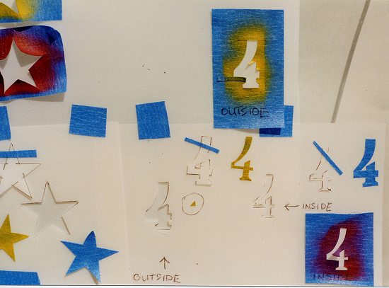
I then remove the completed template carefully and pull from several angles, at the tape on the glass, slowly. Of course, then I lightly tack the completed template to the wing or fuselage. I cover the areas around the template with more masking tape that can be used over and over again since I don't have to press it down very hard. Let's say we're doing the numeral four (4) on the vertical tail of the I - 16. Since the numeral four is red with a yellow outline I spray the red using the "Red" template first. Then I take the cut-out portion of that red template that is still on the auto glass and place it over the red four just sprayed on the model. In essence, I have covered up the red four. OK, you see where we're going, right? Then I put the template that I had previously cut that was the dimensions of the outside of the yellow outline. I put that masking tape template on to the fuselage carefully so that it will line up correctly with the "four" having equal amounts of space all around. Then I cover the areas around the Yellow outline template with the same pieces of blue masking tape I used before and spray on the yellow paint. That is how it is done.
Now, if we're talking about British roundels? Ah, I just finished a Mk. Vb Spitfire in a Nightfighter paint scheme. My first black scheme model. A lot of fun. I couldn't cut a perfect circle of course, So I remembered the circle templates in light bright green plastic that I'd seen ‹ and previously owned ‹ in art supply stores and also at Hobby Lobby. The plastic is thin enough to bend over the wing and can be held down with low tack tape.
For the fuselage national insignia I use the circle template as a guide and ran the #16 X-acto knife around the circle template. I could cut a good circle that way. With the fuselage national insignia on the Spitfire you start with spraying the outside circle first and work toward the center. With the wing national insignia you do it the same way. Remember here that I'm spraying these markings on very lightly. I want them to appear faded like the rest of the paint scheme. By mistake I have sprayed the paint on and overdone it since it is hard to determine just how much is enough. You have all that bright blue masking tape all around the template. Like most things, experience is the best teacher. The good thing is that when I goof up, I just respray the base color on again and then try again with the tape template. I mentioned in the kit review article that the port side national insignia Red Star with yellow outline took three tries. Yes! Again, this approach does take time and patience but with practice it will produce models different from what you usually see and that attract attention. You'll have a one of a kind model. I won't go into the purest viewpoint that there was little weathering or chipping on WWII aircraft. I think modeling can encompass all different views. However, I take a different tack; and the photos I've seen tell me that there was a lot of wear on the front line fighters from the theaters that I chose to model.
2. How I mix my own colors using the theory of the color wheel.
Those little individual bottles of paint are going through the roof,
price wise. Geeeze, over $2.00 a bottle for some acrylic paints. (See: Photo #
6)
Plus if I'm painting the Federal Standard color for the fuselage and I want the
paint to be faded, the approach I take is ‹ and of course this is NOT the only
way to achieve this ‹ I want that FS color to be lighter since it is faded.
Well, as I mention in the I-16 review, I don't buy all the colors available. I was taught how to mix colors in art school. And so I take several hobby paints and mix the exact shade and hue I'm looking for in an extra bottle with lid, that had old unsprayable paint in it. I clean the old paint out by soaking the bottle in a tin of lacquer thinner for some time. Then, whatever residue is left, I get it out with a paint rag. Did you know they sell (inexpensive) large boxes of clean white cotton paint rags at the hardware store?
Now to the color wheel. Some of you may not know that all pigment colors are
made from the three primary colors Blue, Red and Yellow. If you mix pigment
Blue, Red and Yellow together it will make black. Another point: there are large format soft cover books that go into great
pictorial detail about color theory and the proper mixing of colors. These books
are available at the "Hobby Lobby" type of craft stores and at art supply
stores. I've looked at these books recently and they range in price between $8
and $12 with full color explanations. 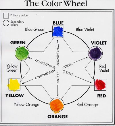
As you look at the color wheel picture I've made for this article you notice that the secondary colors are Purple (violet) Orange and Green. The secondary color Purple is made from, obviously, mixing Blue with Red. Mix Red with Yellow and it makes the secondary color Orange. Mix Yellow with Blue and it makes Green. And of course, you can keep radiating out from the center of the wheel, i.e. mix Yellow with Green and get Yellow-Green. Mix Yellow-Green with Yellow and get Yellow-Yellow-Green and so on. Obviously, to make those colors lighter we can add white. But to make the color we want to be more dull or say darker, it is not a good idea to add BLACK. I don't like to add black to the color I'm mixing. It makes the color go muddy and for me it doesn't work. For that chore I want to use the complimentary color of the color I'm mixing. And as the chart shows, the complimentary color is directly across or opposite the color wheel from the color you want. For example, the complimentary color for Orange is Blue. If I want Insignia Orange that is dulled or darker I add amounts of "Blue" to achieve what I want. I just add a little bit at a time.
However, we didn't talk about mixing those colors we need to make brown, a common modeling color. Well, ‹ a little amount of paint at a time, of course ‹ I mix Red and Yellow and Green to make brown. Remember green is made from the primary colors Blue and Yellow. So Blue is already in the brown mix. If I want a darker brown, I can add Blue to the mix. If I have a brown I like but want it lighter, I add a little white. If I want it a little warmer, I add Red. If I want it a little more mellow, I add Yellow. And so on. Hopefully, this discussion on mixing colors will help those who would like to paint a weathered, faded aircraft model or will help those who don't enjoy paying over $2.00 each ‹ ouch! ‹ for that tiny tiny bottle.
3. The total model presentation: more to it than just building the model. I don't take this approach for each model, but for the model that I'm really wanting to be special; for a model I want to have say a lot about my creative energy, my desire to march to a different drummer, to show my individuality, etc. I start thinking about how the project will all go together for some time. I do this before I ever start on the construction of the model. Sometimes I make notes and do sketches of ways to approach the "presentation" as a total package. One of the ways to be more creative with how the model is displayed is in building a base for it to sit on. Another way obviously from what I've written above, is the paint scheme for the model.
 When I start with the entire presentation as a part of my thinking, I am able to
coordinate the colors to a more harmonious scheme and the composition to a more
eye-catching and effective aspect of the total plan. Believe me, composition is
very important in modeling presentations. The balance of elements, the spatial
relationship of one object to another does make a big difference, visually. All
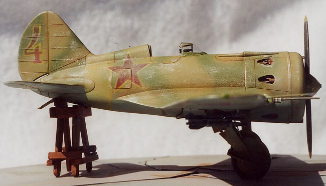
that takes advance thinking and good planning. With the I - 16, since the model
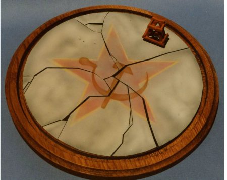
was faded and weathered, I felt the base should reflect that concept as well.
The base shown in the picture is the temporary one. I didn't have time to do the
final one I'm going to do, in time for the Chicago IPMS/USA convention. So I put
the Russian Star and Hammer and Sickle in a faded and cracked cement tarmac for
the I - 16 to sit on.
When I start with the entire presentation as a part of my thinking, I am able to
coordinate the colors to a more harmonious scheme and the composition to a more
eye-catching and effective aspect of the total plan. Believe me, composition is
very important in modeling presentations. The balance of elements, the spatial
relationship of one object to another does make a big difference, visually. All
that takes advance thinking and good planning. With the I - 16, since the model
was faded and weathered, I felt the base should reflect that concept as well.
The base shown in the picture is the temporary one. I didn't have time to do the
final one I'm going to do, in time for the Chicago IPMS/USA convention. So I put
the Russian Star and Hammer and Sickle in a faded and cracked cement tarmac for
the I - 16 to sit on.
Many reference photos showed I - 16s up on metal or wooden frames to raise the tail for repair and I thought, oh my! I've never seen a model displayed that way but there it is in the photographs! By the way, to make the very large templates to spray on the Red Star and Hammer and Sickle for my temporary base, I made them in black outline, drawing them in my Macintosh drawing program. I printed out the line art several times and cut the group of templates with an X-acto knife as explained above. For my final base ‹ yet to be built ‹ I want to build a quality hardwood base that is about 3 1/2 inches high in a pentagon shape. I intend to have a plex top built for it. The part of the base in which the I - 16 sits upon will be the same icon as with the current temporary base.
Before I go farther, I should say that I realize that when entering IPMS contests in the single engine prop. category the base is not even considered. And I agree with this thinking. I'm not talking about the judges criteria here. But I am talking about the viewing of the model by the general public and other modelers. A model that sits that much above the other aircraft on the table is going to attract attention. Of course, I don't want to overdo the height. But isn't that a different way of thinking about the total presentation. Something a little height with the base attracts more attention. You notice the word Empire is in that building's name. Figure modelers "figure" out ways to do this (add height) all the time.
But, back to the subject. I've seen very beautiful aircraft models on a piece of plywood with simulated terra firma that is extremely well executed. Then I notice the rough edges of the plywood at the ends of the plywood rectangle. Those rough edges need to be covered with some good looking material that is in harmony with the base, it's colors and the model. The whole presentation need to be considered when building. Hopefully, I've made my point. Sorry if this sounds like I'm preaching here. I don't mean to. There is no wrong way to build models. Do it for fun. I'm just enthused about the way I conceive the final product. I wanted to pass on this view. But of course, I'm still learning.
<>
4. The kind of paint brushes I buy and use do make a big difference. Again, art school convinced me that the best quality brushes I could afford was the direction to go. I still have most all the brushes I bought in my freshman year of college. They are pure red sable. They were expensive way back then and they are even more expensive now. But these quality brushes really do make a difference. However, I would only recommend one brand of pure red sable artist brushes. And no, I don't work for this company nor get any compensation from them. Windsor Newton is a British art supply company in business a very long time. Their best red sable brushes are the SERIES 7 with the black handles. Pictured here is the set my daughter bought me last Christmas. I use the triple zero (000) to paint aircraft canopy frames. Therefore ‹ although I realize they're 'hot' and the latest thing ‹ I don't have to pay the added expense of buying those canopy masking products. I support the canopy (to hold it perfectly still) on a stack of 2 X 4s mentioned in the I- 16 review and I support my hand the same way. The W-N series 7 brushes will hold ‹ thru a lot of use ‹ and will keep holding a perfect point. I haven't found another red sable brush that can do that; especially after I've had it a while. And when I'm painting tiny objects like canopy frames and eyeballs it really makes a difference.I take very good care of my brushes. I clean them in thinner and then wash the bristles in the palm of my hand at the sink with dishwashing liquid after every use. (I feel that good working habits are important to modeling.) While the bristles are still wet, I form a perfect point with the head of the brush and store them with the head up, of course. If you don't own these brushes, once you try the Windsor Newton series 7 you will understand.
5. Conclusion
I hope this long winded dissertation has been of help to someone. Model
building is a wonderful hobby and for me the reason is because of all the really
class individuals I've met and kept in contact with over these long years. Yes I
am old but I think all those years and the aging process has given me a
perspective on just how worthwhile this avocation really is. I hope I have given
you something to think about. Happy modeling
Rick Brownlee